
7 Tips to Improve your Archviz
You’re admiring your latest render. The models look great. There’s bevels on everything. No shading issues. But something feels off.
Ah, yes. You’re not finished.
Taking an image from good to great, is something a lot of artists struggle with. So here are 7 helpful tips I’ve learned over my years in professional archviz.
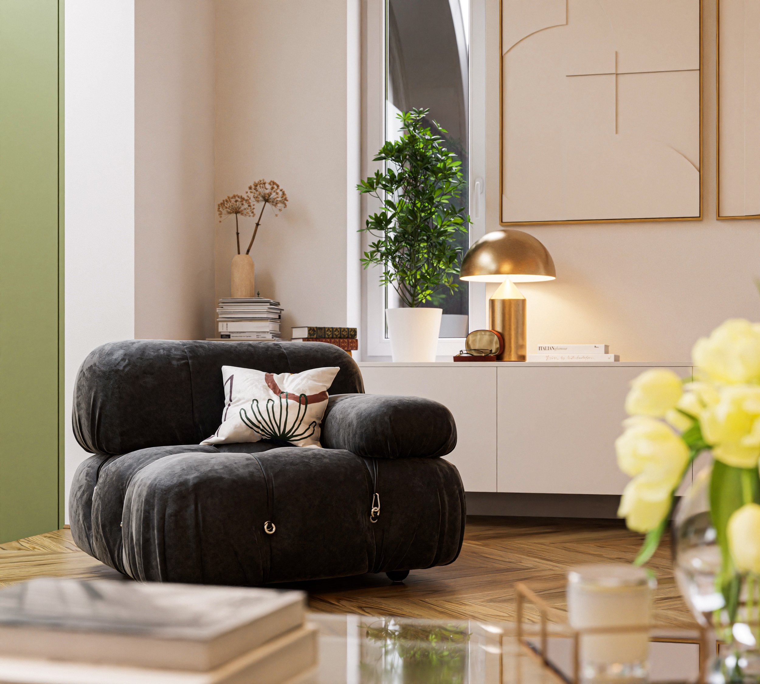
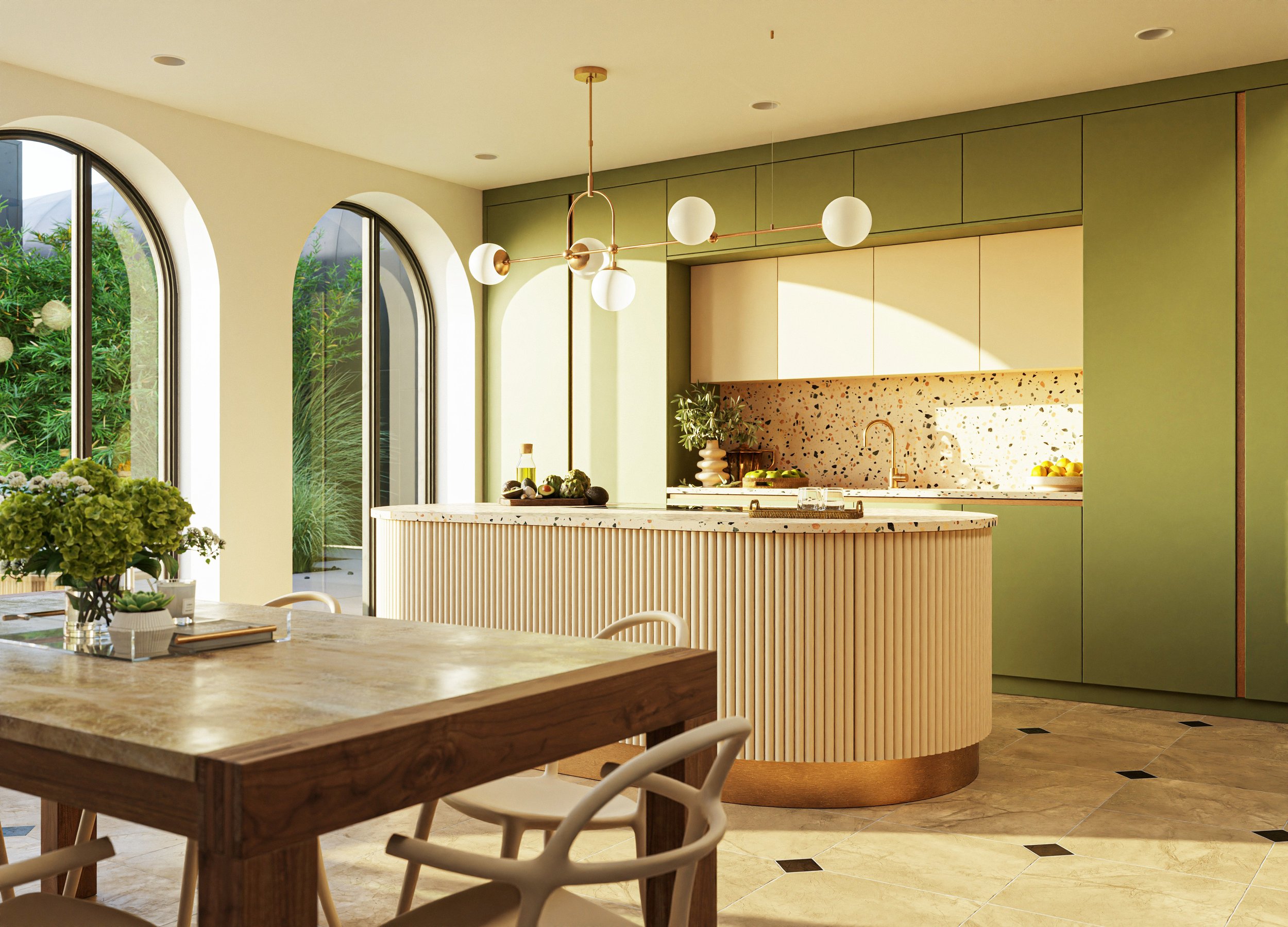
1. Decorations should be beautiful, useful or both
Archviz is not so much about imitating the real world, as it is about creating the utopian vision of it. The lived-in feel comes from people using the space and adjusting it to their needs over time, not from random “stuff”.
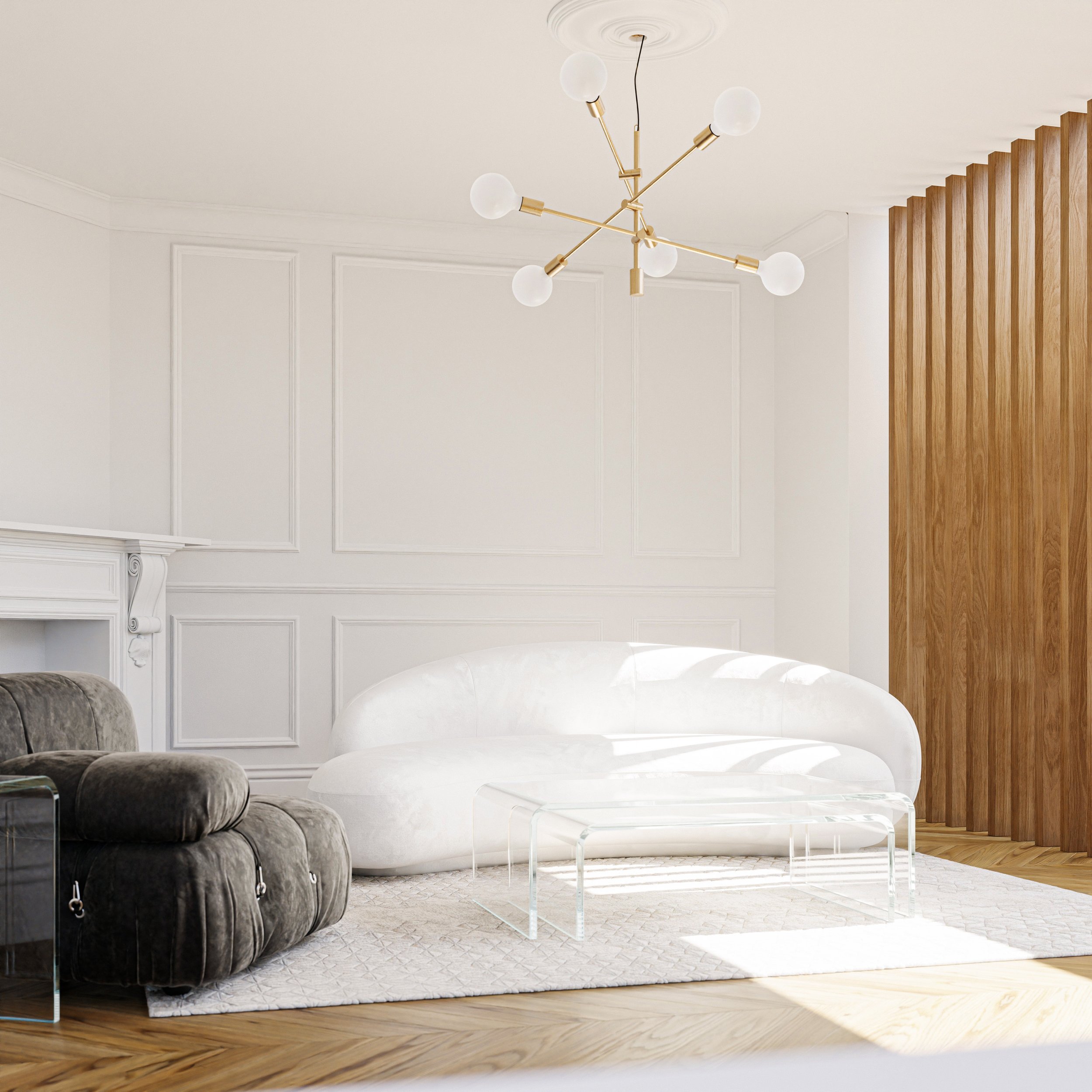
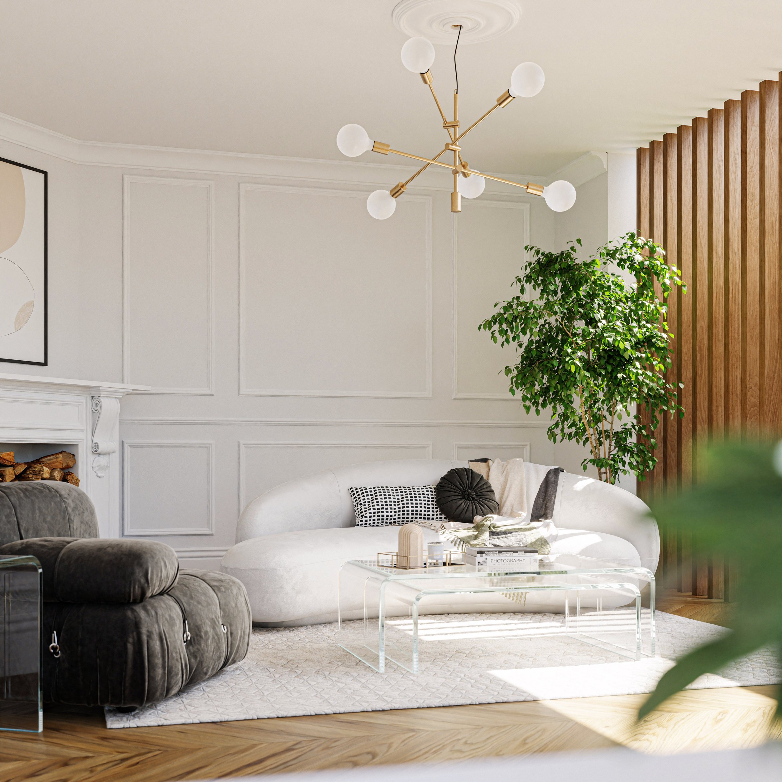
2. Reduce the clutter
The more clutter in your scene, the less any individual element can stand out. In general, less is often more. Be choosy and only place objects that complement or add to the story.
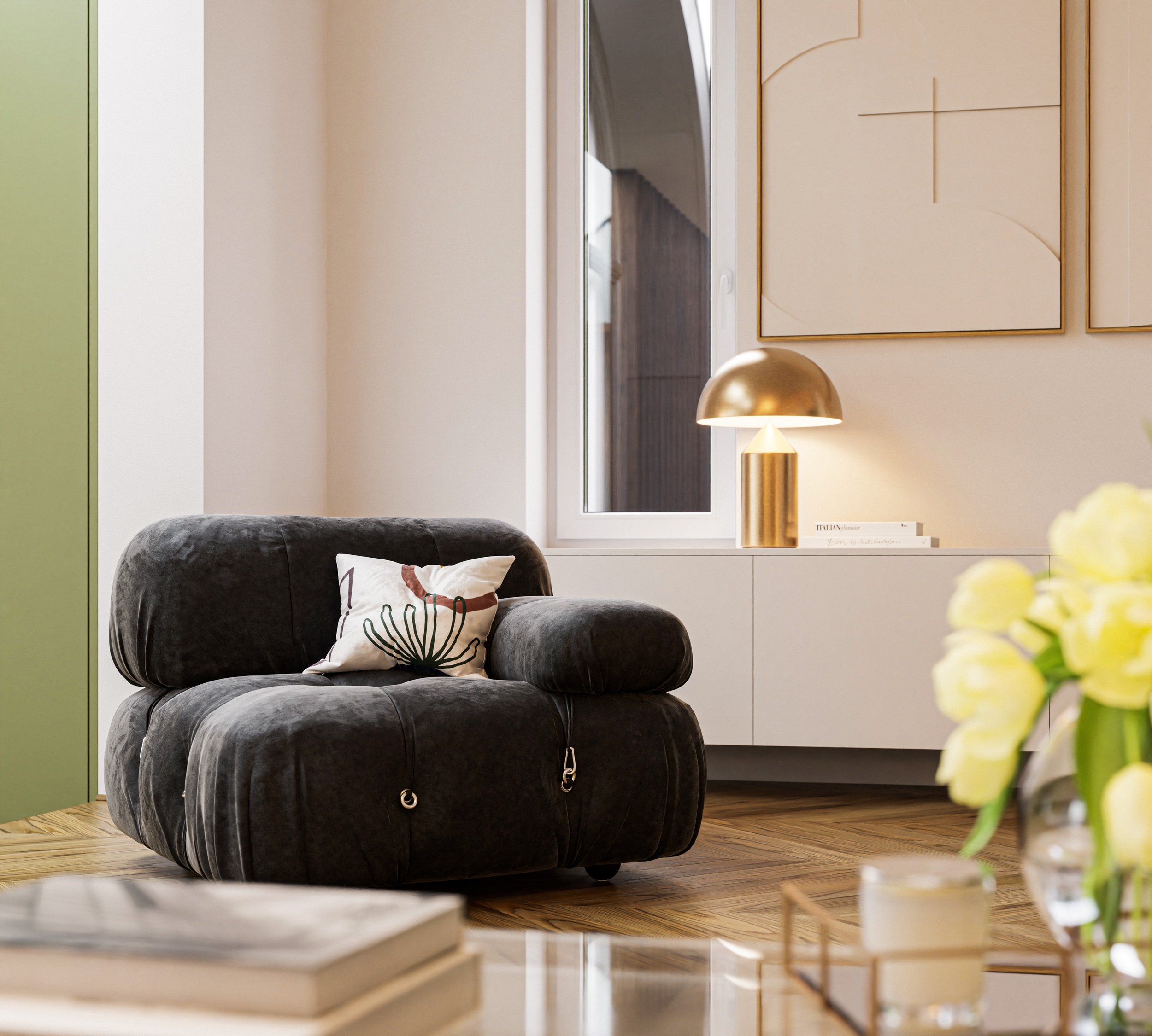
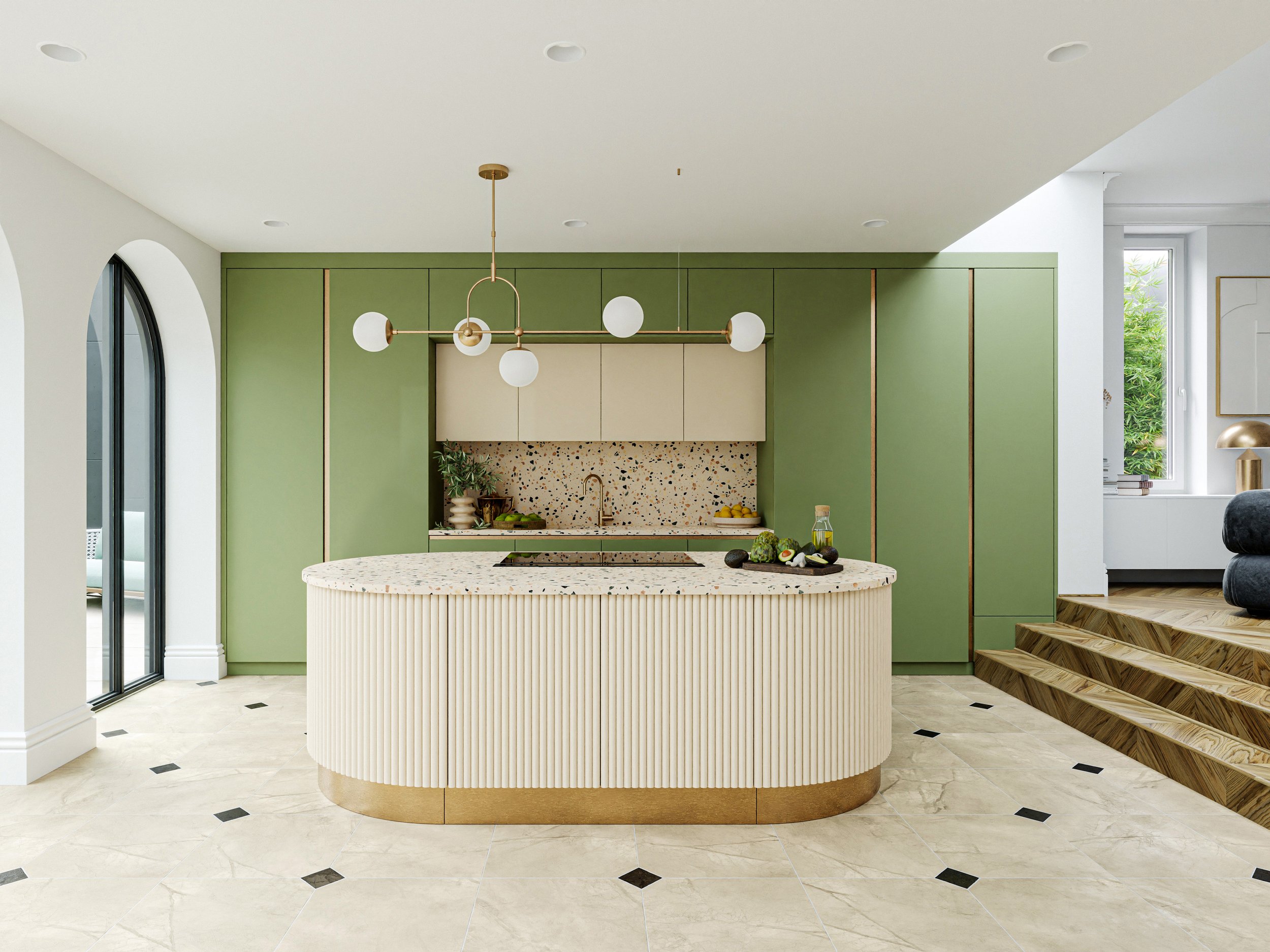
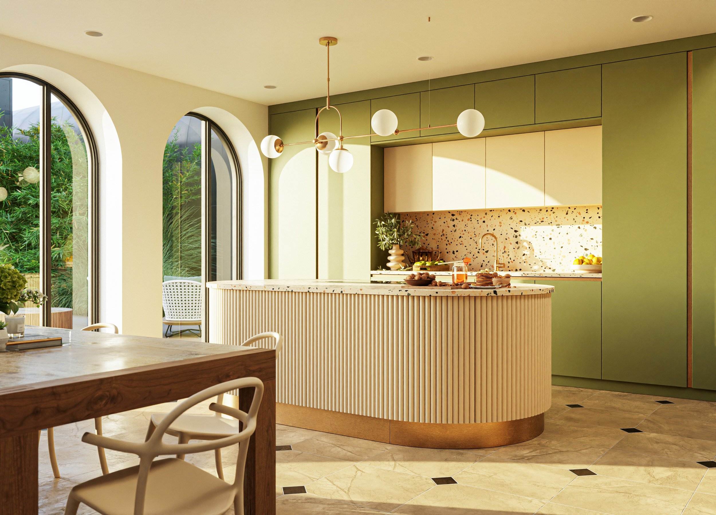
3. Reposition props between shots
If it’s not cemented to the floor, you can reposition items to suit the composition of each shot. Professional architectural photographers do this all the time.
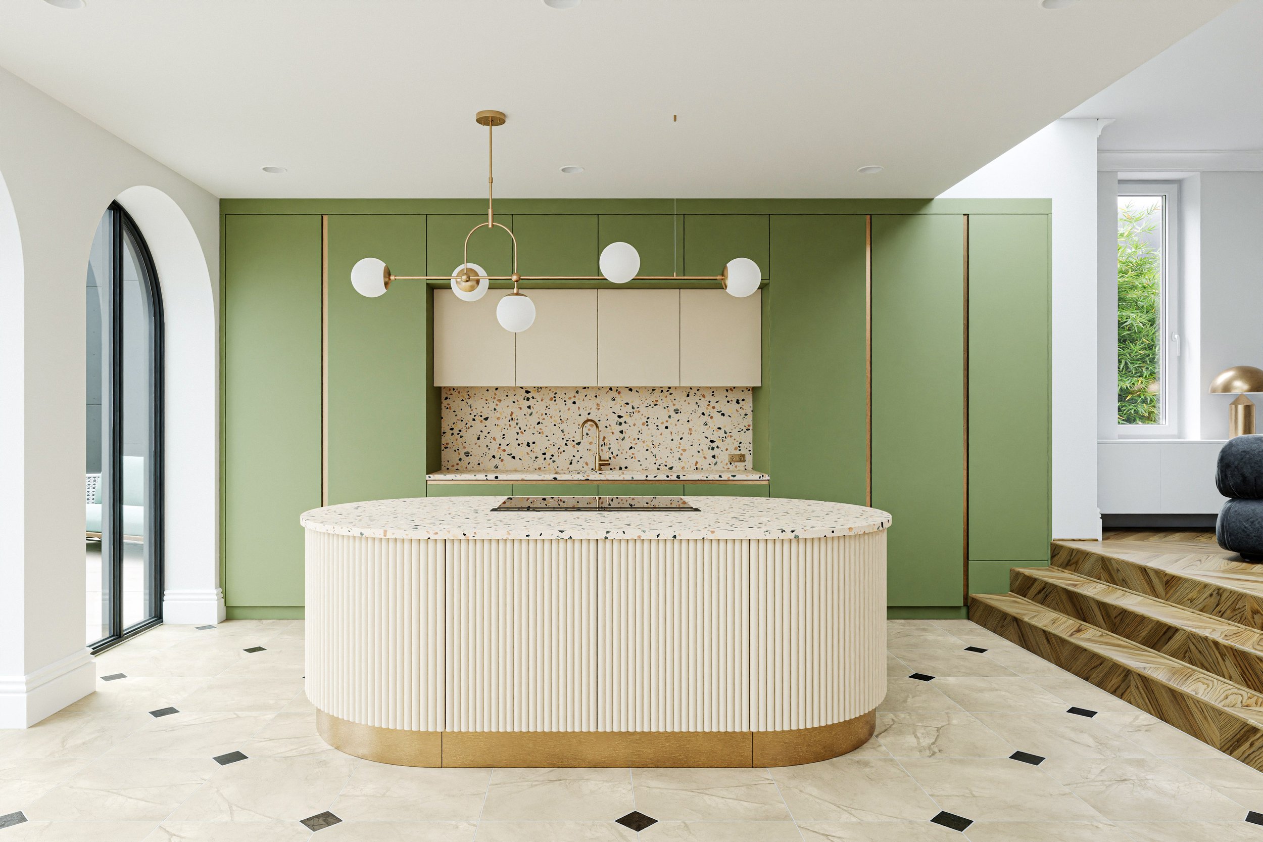
4. Choose assets that fit the lighting
Archviz renders often have idyllic sunny or overcast lighting as it tends to make the natural colors of the objects pop. But what many artists forget is that lighting also limits the choices you can make when it comes to the 3D assets used to tell your story.
High‑quality textures from Poliigon can help your scene stand out with increased photorealism.
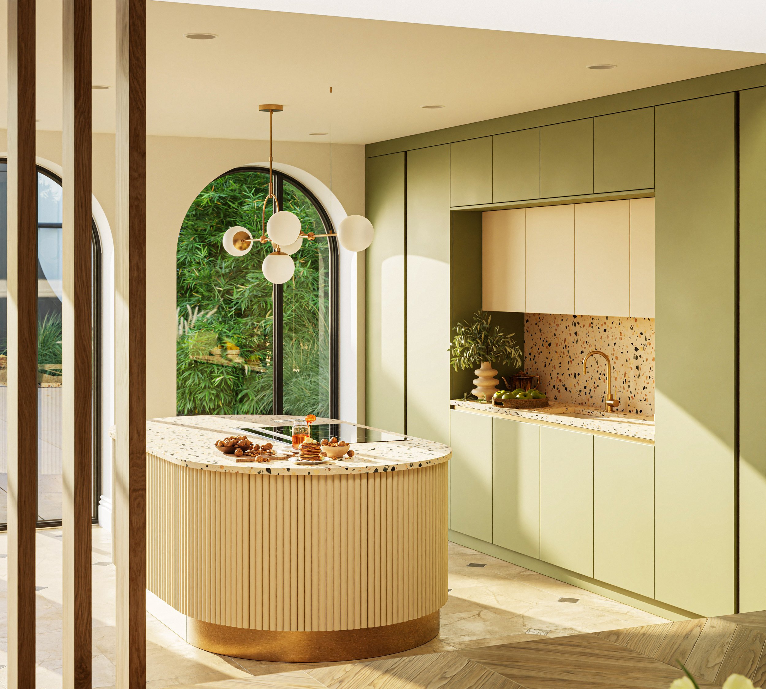
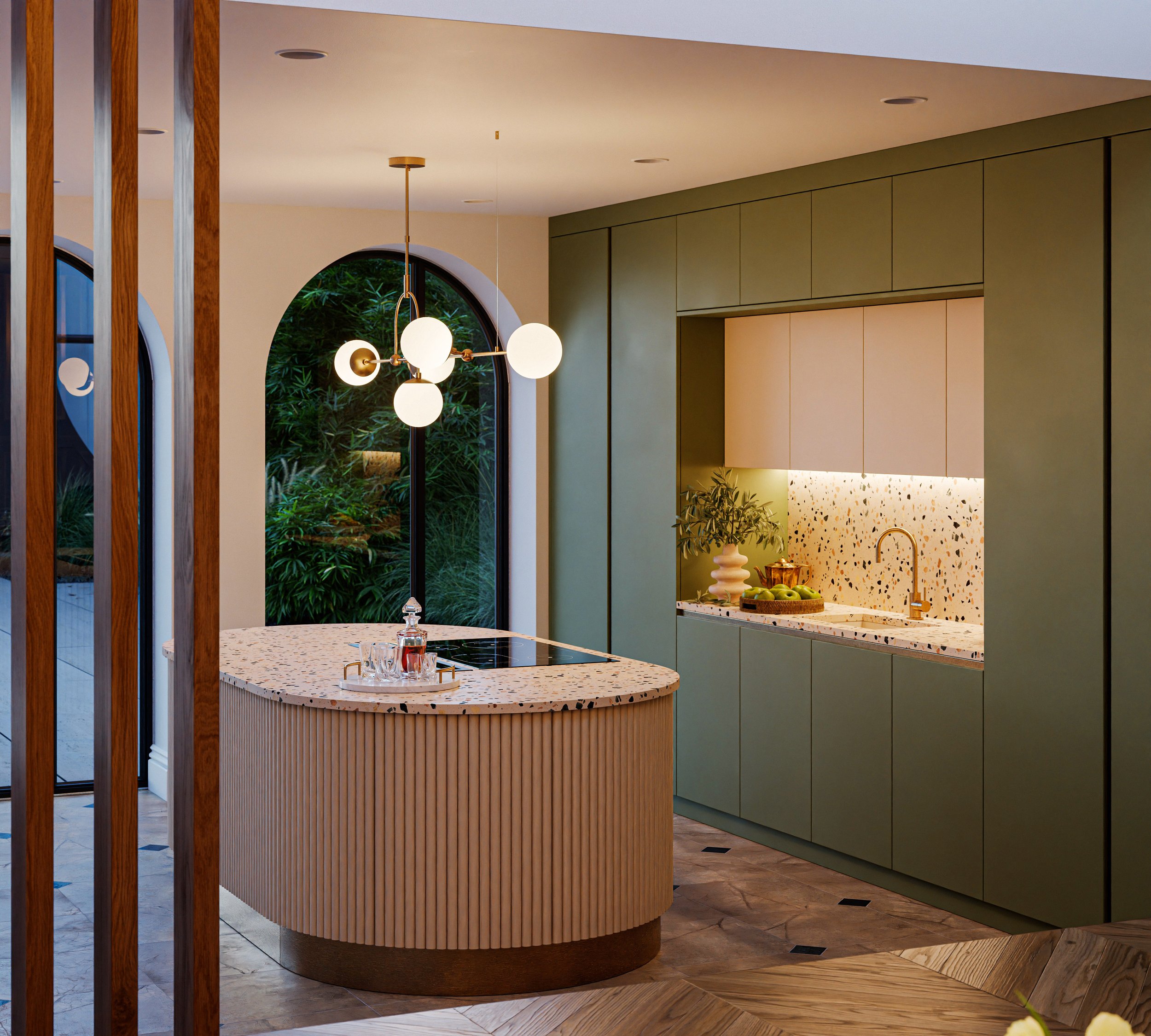
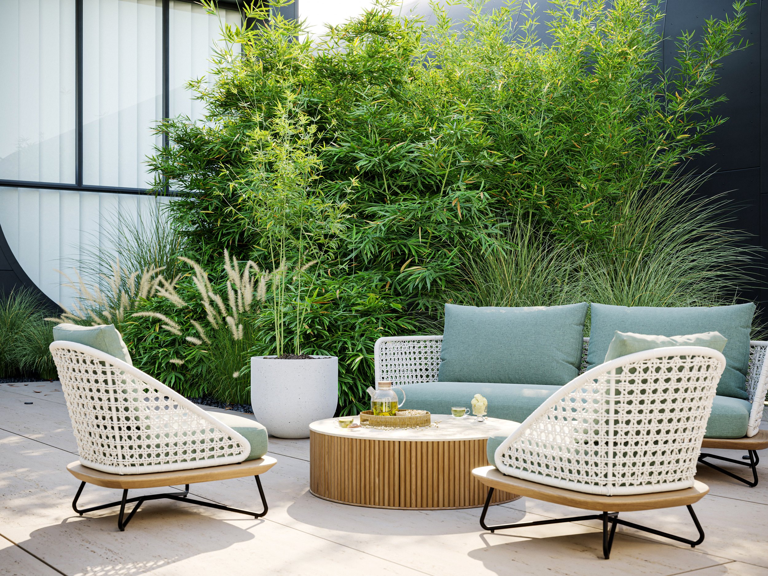
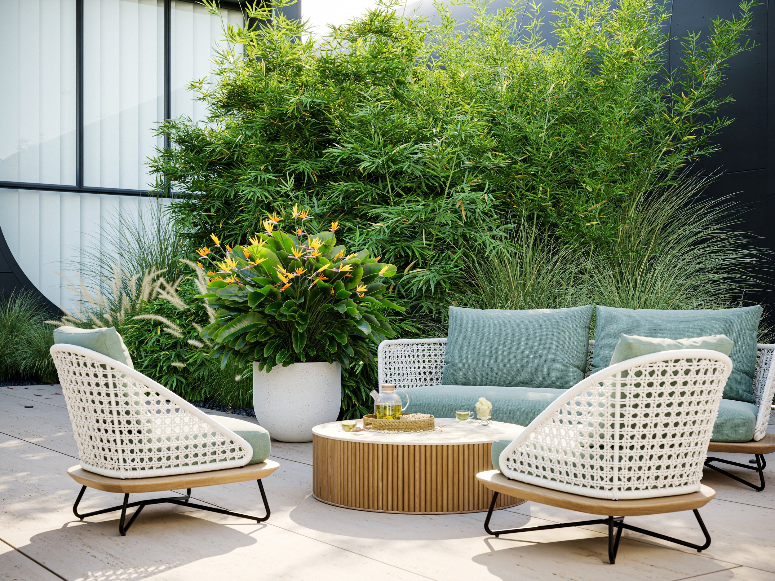
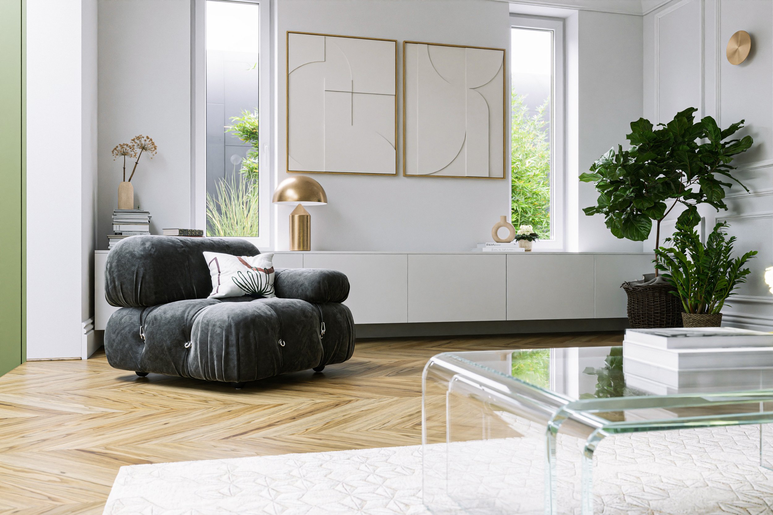
5. Use plants as focal points
All plants have slightly different tints so your choices will depend on whether you want them to pop out or blend in. For example, in a dark living room, adding a plant with dark, deep green leaves won’t shift the scene’s focus but that same plant can be an amazing focal point when the walls are painted light.
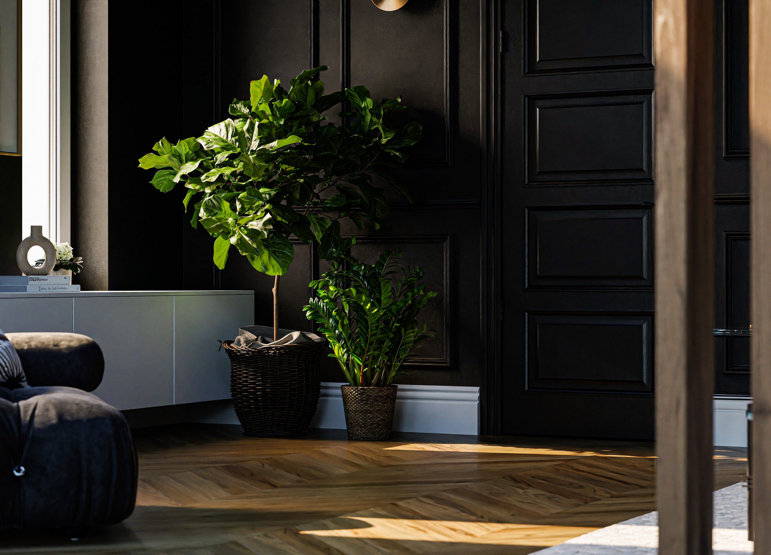
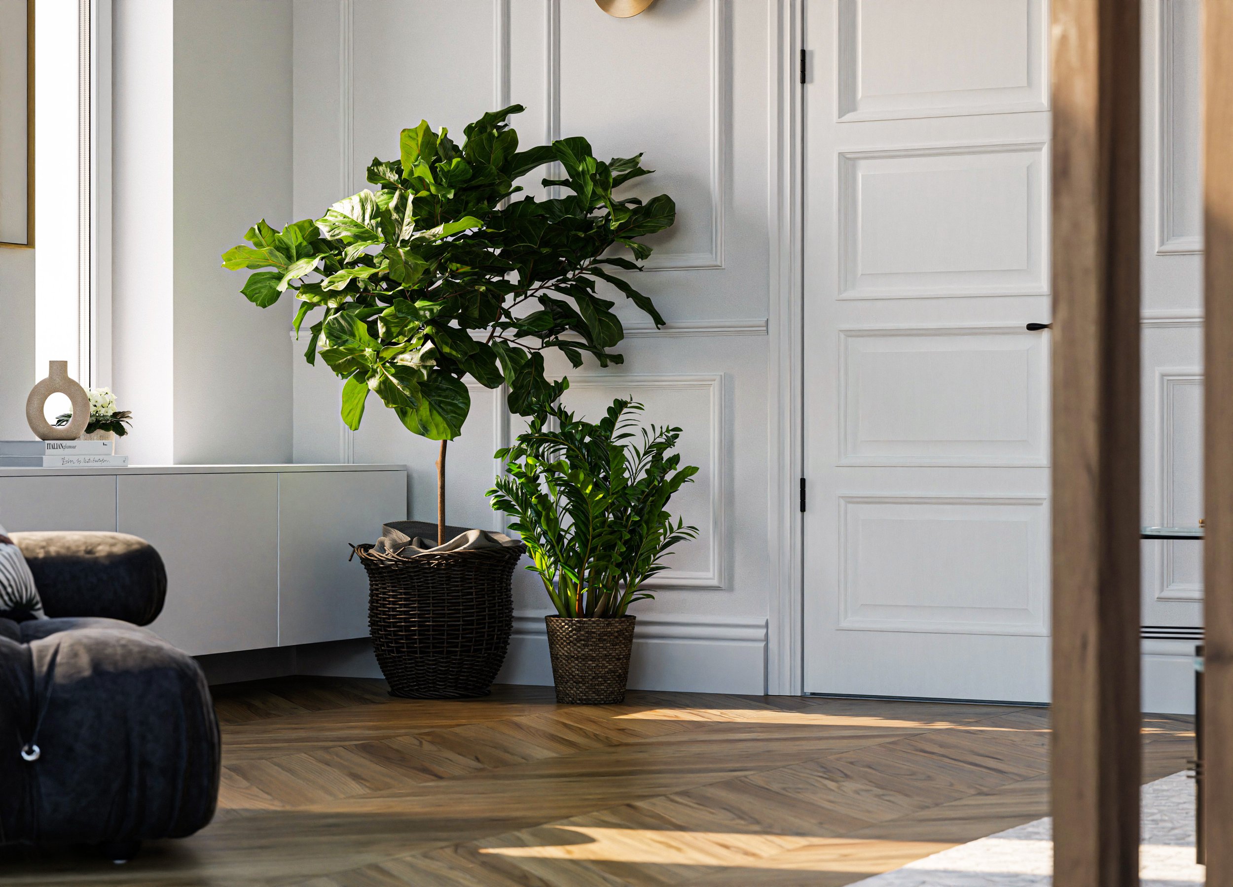
6. Make your plants readable
Plants tend to make a space appear calmer, but if you already have high-frequency details in your scene like busy background, adding a plant with small or detailed leaves (e.g. monstera, palm, ficus benjamina, or bamboo) might cause the scene to look too busy. Plants with large, uniform foliage (e.g. strelitzia/bird of paradise or fiddle-leaf fig) are safer options for adding life and color to a scene or can be used to balance out busier plants.
7. Place plants where they’d naturally thrive
This is crucial, especially when aiming for an image that feels realistic. Not a single plant thrives in a dark windowless bathroom, so only place them where sunlight would reach: near windows, doors etc.
To sum it up, making interiors inviting involves a lot more than just throwing in some decorative items. It’s a delicate balance between personality and aesthetics, which can make or break the final image.
You’ll need practice, but it gets easier with every attempt.