The 7 most common interior archviz lighting mistakes (and how to fix them)
Lighting is one of the most important factors to beautiful archviz. You can get everything else right - but with poor lighting, it won’t matter. To avoid undermining all that hard work, here are the 7 most common mistakes artists make, and how to fix them.
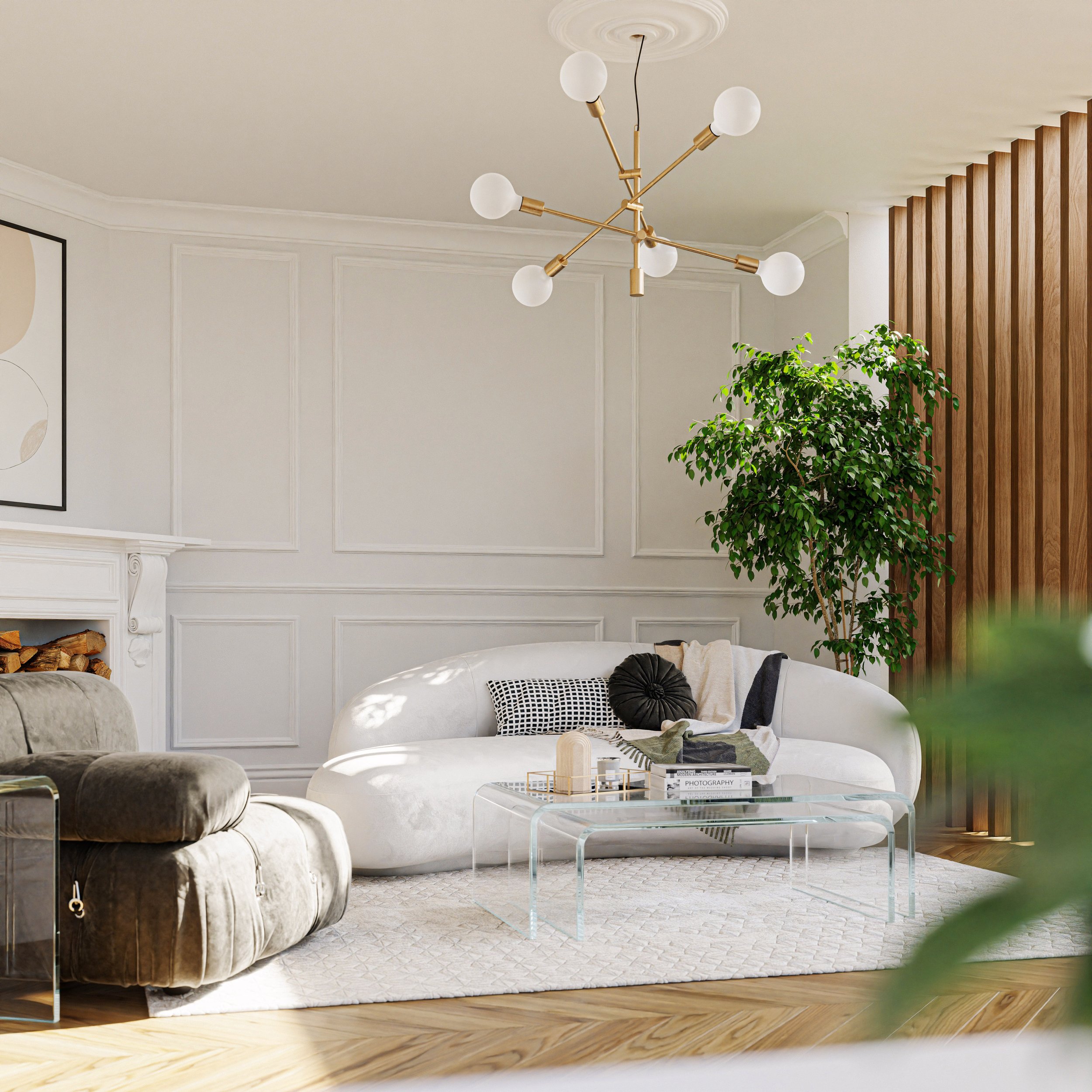
Mistake #1: Trying to light everything.
Humans like light, but ‘where there is light, there must be shadow’. Although you may want everything to be lit evenly, that can create a bland, uninteresting image.
And it’s not just artists; it’s often what’s requested by the client, who wants every single lamp to shine as bright as the sun.


What to do instead: Let shadows live!
Instead of tweaking your lights, first try adjusting the exposure. This more closely resembles what photographers do in real life, since no one can play God with the weather.
If you desperately want to add more light to your scene, do it in the most natural way possible - by adjusting the light, so that it bounces into that spot. Avoid hidden lamps or invisible light sources and remember that there’s hardly any light coming in from the ground, so make sure your environment’s bottom half is dark. Do your lighting with minimal effort to ensure it’s natural - after all, the sky is just a big blueish dome with a sun lamp.
But while some people use too much light, some people don’t use enough…
Mistake #2: Not using enough light.
A very common mistake for beginners. Dark interiors often look uninviting.


What to do instead: Let the light in.
Make sure the time of the day is clear. Make it look like morning, noon, or afternoon. (Evening might be too late, but we’ll talk about that soon).
Real estate photographers shoot in broad daylight, with open curtains to let in as much natural light as physically possible - so mimic that (while avoiding mistake #1).
Mistake #3: Fearing overexposure
While in many cases blown out highlights are bad, they can often be used for artistic appeal.

What to do instead: Overexpose with intention.
You don’t usually want important information to be clipped, but simple areas (like walls and uniform colored objects) are fine. Eyes are naturally drawn to areas of high contrast, so placing a dark object against a bright backdrop can create a beautiful silhouette and clean composition.
Pro-tip: If you’re on a tight deadline overexpose your windows. No trees required!
Mistake #4: Overusing HDRI skies.
A good HDRI is a must-have for every archviz artist - it’s the most complex and realistic lighting setup you can have, in the easiest-to-use form, with free color information, reflections, and a backplate of beautiful clouds and colors that match the lighting.
But do you need all that color information for an interior, when you can’t even see the sky? Often the reflections from the interior are what’s important, and a complex sky could not only needlessly increase your render times but also make it harder to control the colors of the scene.

Instead of an HDRI this image is using a physical sky model.
What to do instead: Use HDRIs when effective
For simple glimpses of sky, either using a single environment color value, or use the prebuilt physical sky system that most render engines include nowadays. This is often all you need for the vast majority of cases, and it comes at a fraction of the memory and render times.
Mistake #5: Turning on artificial lights in the daytime
Why would this countertop need overhead lighting at noon? Not only is it impractical, it’s often implausible, as artificial lights would barely be visible against powerful sunlight.


What to do instead: Use blue hour lighting
If you want the viewer to see both the exterior and interior, try blue hour lighting. It’s in every architectural photographers playbook. The blue lighting is low enough in intensity that it’s plausible a camera to expose for both. And best of all? Blue/orange colors go together better than PB & J.
Mistake #6: Forgetting about the exterior
Unless your rendering a house in the desert, unobstructed sunlight is rare. Hinting at exterior elements (aka Implied lighting) is not only more realistic, it’s more interesting.


What to do instead: Add shadows that simulate exterior foliage.
Dappled sunlight accomplishes 3 things:
prevents harsh light from clipping
adds visual texture to boring uniform areas
extends the scene beyond the frame
You don’t even need tree models. Tree cards (or animated ones) in front of windows are the oldest trick in the book!
Mistake #7: Misguiding the viewer
Eyes are naturally drawn to the brightest part of your image. So if the sunlight falls on the wrong area it can destroy your composition.

What to do instead: Direct the sunlight to your focal point.
Photographers have to wait for the perfect time of day, but CG artists don’t. Just rotate the sunlight to fall where you need it!
Know the rules…so you can break them.
There’s nothing scary about lighting. While there are some rules that you’d be wise to follow - like avoiding even exposure of the entire interior, or having artificial lights on in broad daylight - you should feel free to experiment.
With time, every artist develops their own personal preferences when it comes to lighting a scene. And that’s why it’s crucial to know the basics, first - in order to weed out avoidable mistakes that could undermine your work - but second, so you can break them when it makes sense to.